This is where it all comes home. The user filled out your questionnaire in anticipation of a result that adds value and/or is interesting. So job number one is to delight the customers. Here is how you can do it!
1. Show Rich Results
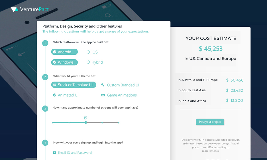
To make the results richer, you can show multiple results instead of just a single number. For example, showing app development cost estimates by region adds to the analysis. Or while showing ROI, you can show ROI over 6 months, 1 year and 2 years.
2. Use Images & Charts
Where possible, use graphics to make the user experience more appealing.

3. Show Comparisons
You can even show comparisons. For example, showing a comparison between “how much would you save by using [company’s] products”.
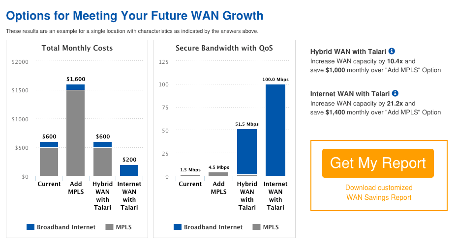
How Talari Networks displays its value proposition clearly in the form of a comparison
4. Show Breakdown
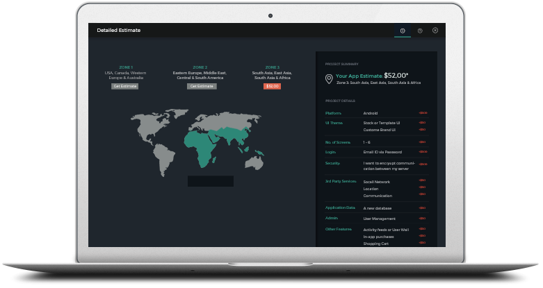
Instead of simply giving a number, as a result, you can even try to showcase the cost breakdown of each of the line items in a quoting calculator for example. This can allow the user to see how each component impacts the price.
5. Have a clear call to action
Now that you have added value to the user think about what is the right next step for a user at that point and have a clear call to action on that page.
6. Provide Ranges
Services businesses like legal and software design will usually provide a range: cost is between $8K to $12K, instead of saying $10K. This reduces the risk of committing a specific price point to a user.

7. Have a Disclaimer
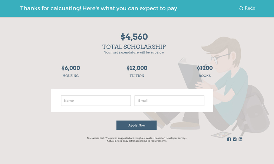
It’s good to have a short disclaimer saying that all results are not binding in any way and are simply estimates to be used for educational purposes. This way you are not guaranteeing anything in the calculator.
You can get more details on how to map results for a quiz or calculator in this video -