
The appearance and branding of your Member Portals ensure your members get the look and feel they have come to expect when visiting your club site. Setting the appearance and branding also helps create an attractive page that provides a welcoming look for your members when accessing and viewing personal Golf Shop information.
In this article, we will discuss the following options to help you brand your page:
Accessing Member Portal Branding and Design Page.
Change the color scheme.
Add a background image or color.
Adjusting the Container opacity.
Adding your banner.
Container Width.
Adding a flash message.
Portal Layout (For Complete Details on setting the portal layout, Click Here.)
Accessing Member Portal Appearance Settings:
All the available appearance options in the article can be accessed when creating a new page or editing any existing Member Portal. To access and edit appearance setting, follow these directions:
Go to Communication > Member Portals.
Click the action dropdown for the page you wish to edit and click "Edit" (as shown below).

Make the changes as necessary.
Click "Save."
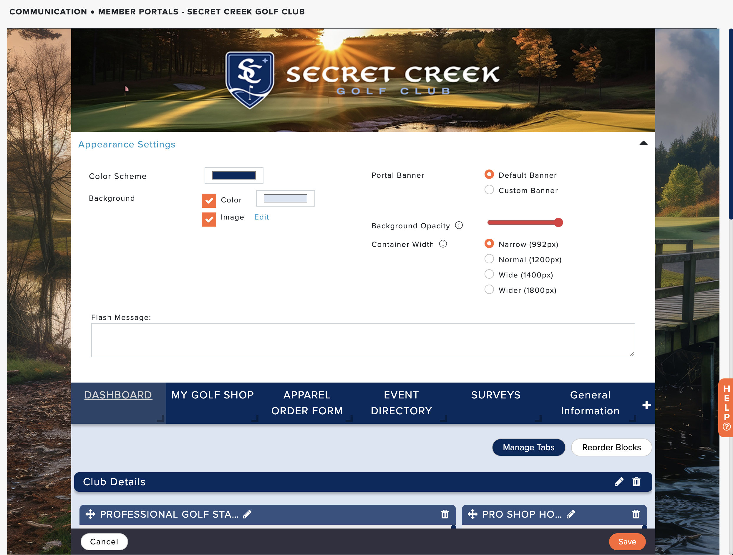
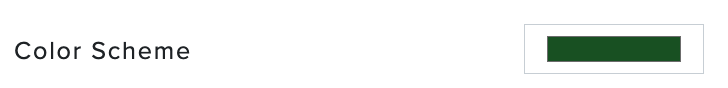
Color Scheme:
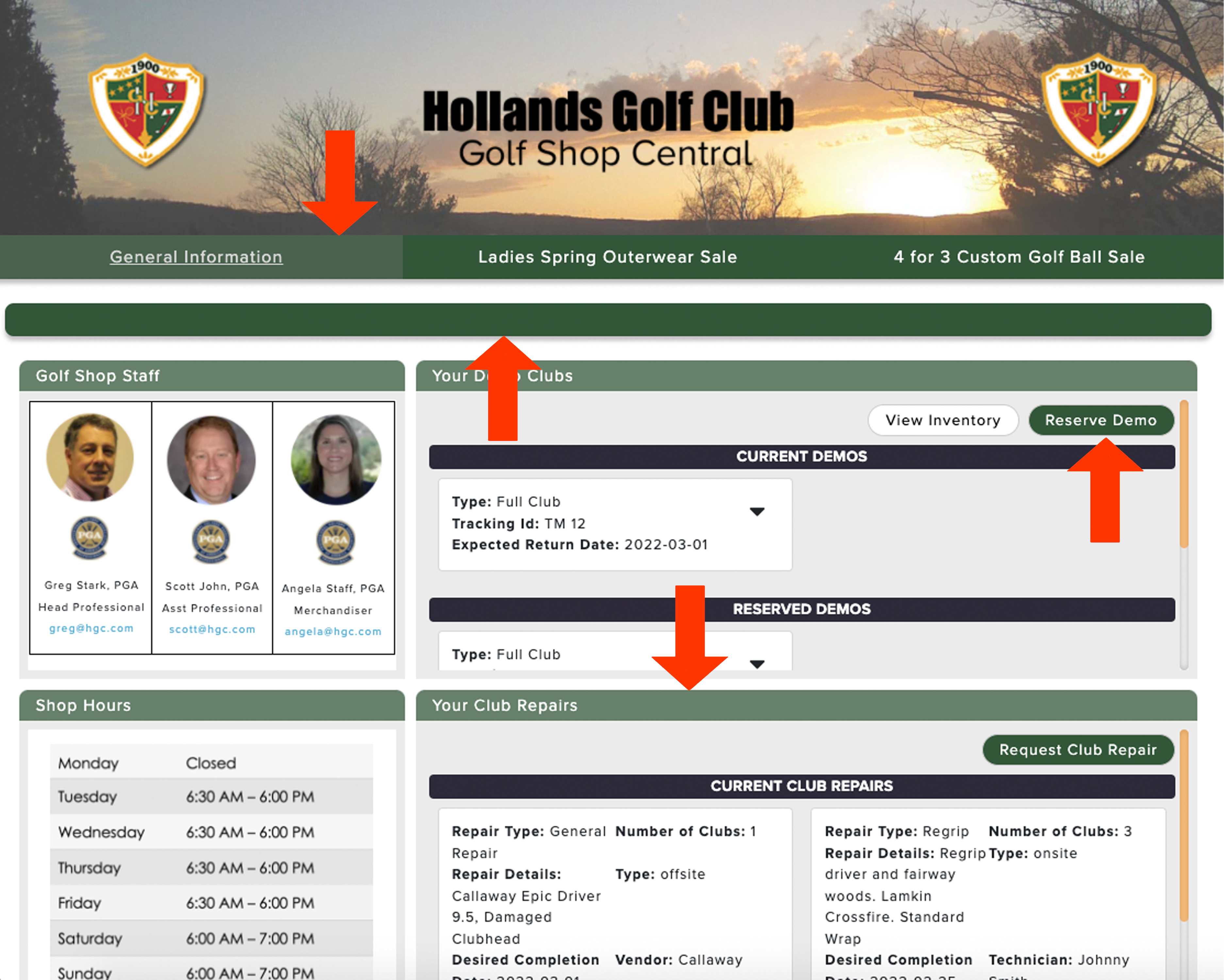
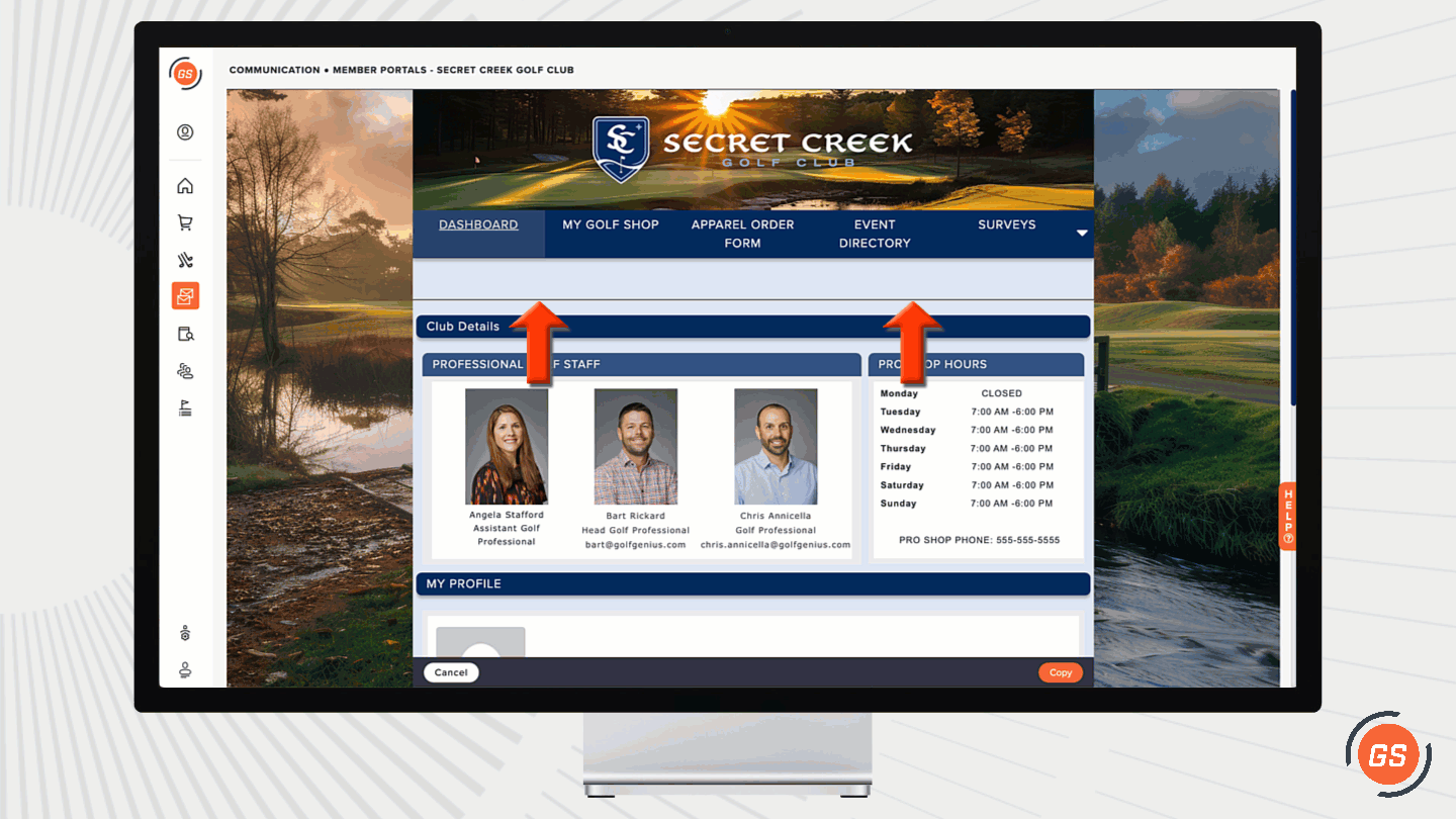
The color scheme is used for tabs, tile breaks, tile headers, and other areas (as shown below).
To change the color scheme, follow these directions:
Click the Color block next to "Color Scheme" (as shown below).

Select a color using the color code picker, where you can enter RGB, HSL, or HEX color code values to find a specific color (as shown below).

To complete the change, click "Save" in the lower right-hand corner.
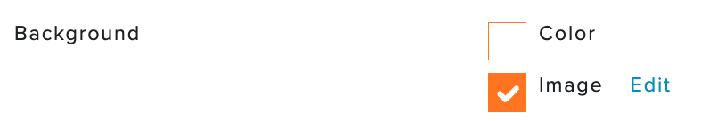
Add A Background Image and Container Color:
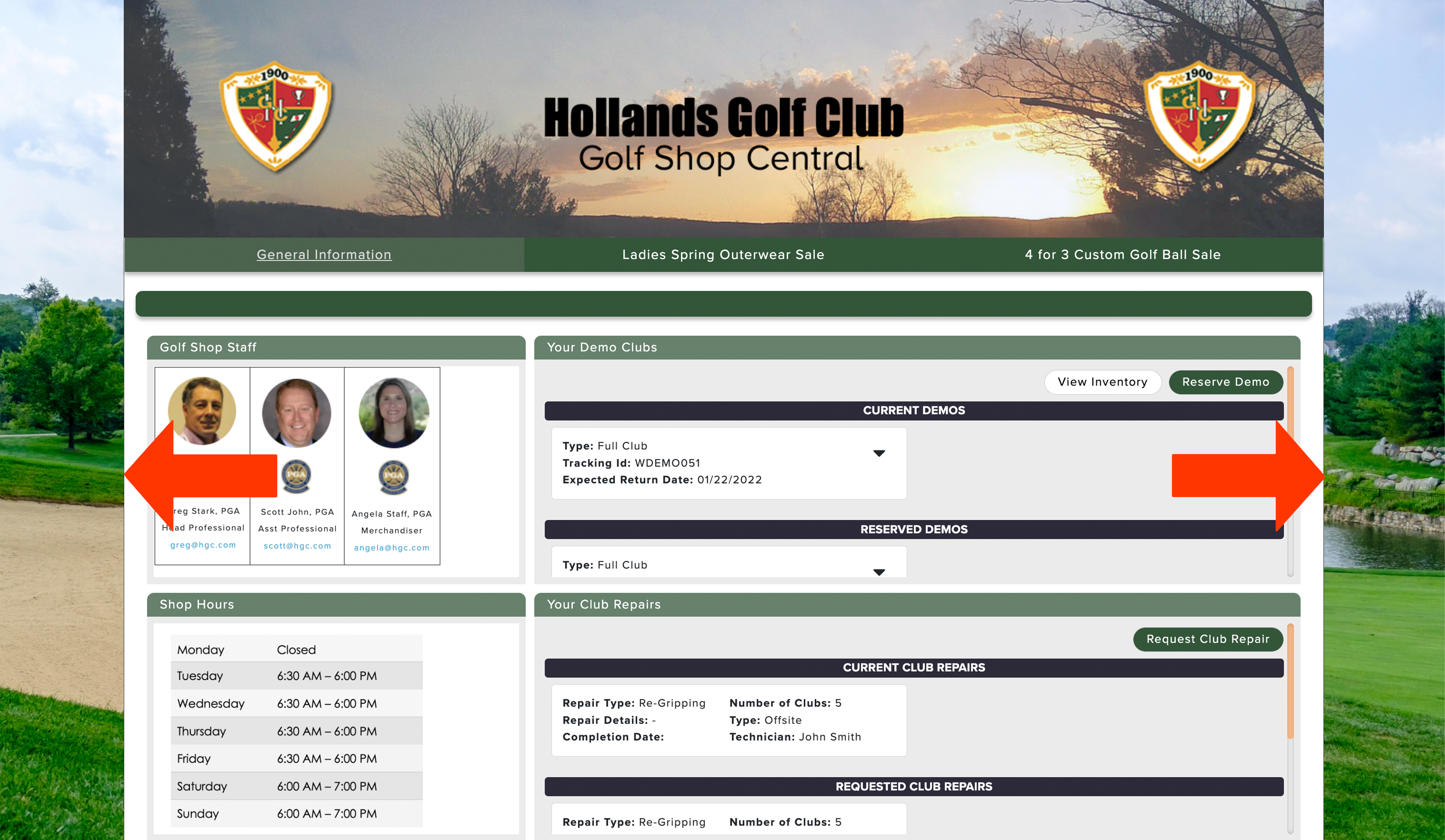
The background image covers the entire portal backsplash (as shown below).
When setting your background, you will have three options:
Check "Color" Only: This allows you to define a color for the background (if "Image" is not checked) or container (if "Image" is checked) using the color code picker. You can enter RGB, HSL, or HEX color code values to find a specific color RGB color and set it as the color.
Check "Image" Only: This allows you to upload an image for the background. Note: It is highly recommended to use a high-resolution image to avoid grainy imaging. The maximum upload size is 6 MB.
Check "Color" and "Image": This allows you to upload an image for the background and adjust the color within the container to another RGB color besides white.
Uploading an Image:
If you would like to use an image, follow these instructions:
Check the box for "Image" (as shown below).

In the pop-up, navigate to the image you wish to upload.
Click on the file and press "Open."
To complete the upload process, click "Save" in the lower right-hand corner.
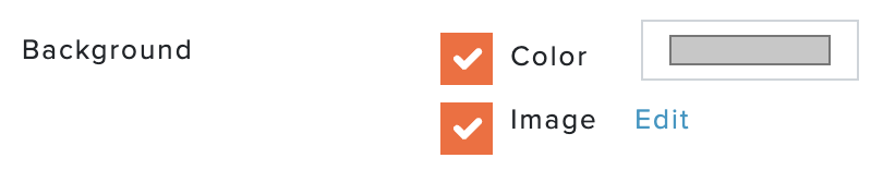
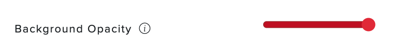
Adjusting the Container Opacity:
The container fully covers the background when the opacity is 100%. If you would like the background image or color to show through some areas of the container, you can adjust the opacity of the container (as shown below).

If you would like to adjust the opacity of the container, follow these instructions:
Set the "Background" to Color and Image (as shown below).
Set the image by clicking "Edit".
Set the container color by clicking the "Color" block.

Move the slider left or right for "Background Opacity" (as shown below).

To complete the change, click "Save" in the lower right-hand corner.
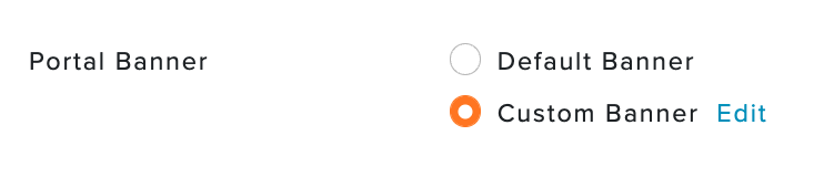
Adding Your Banner:
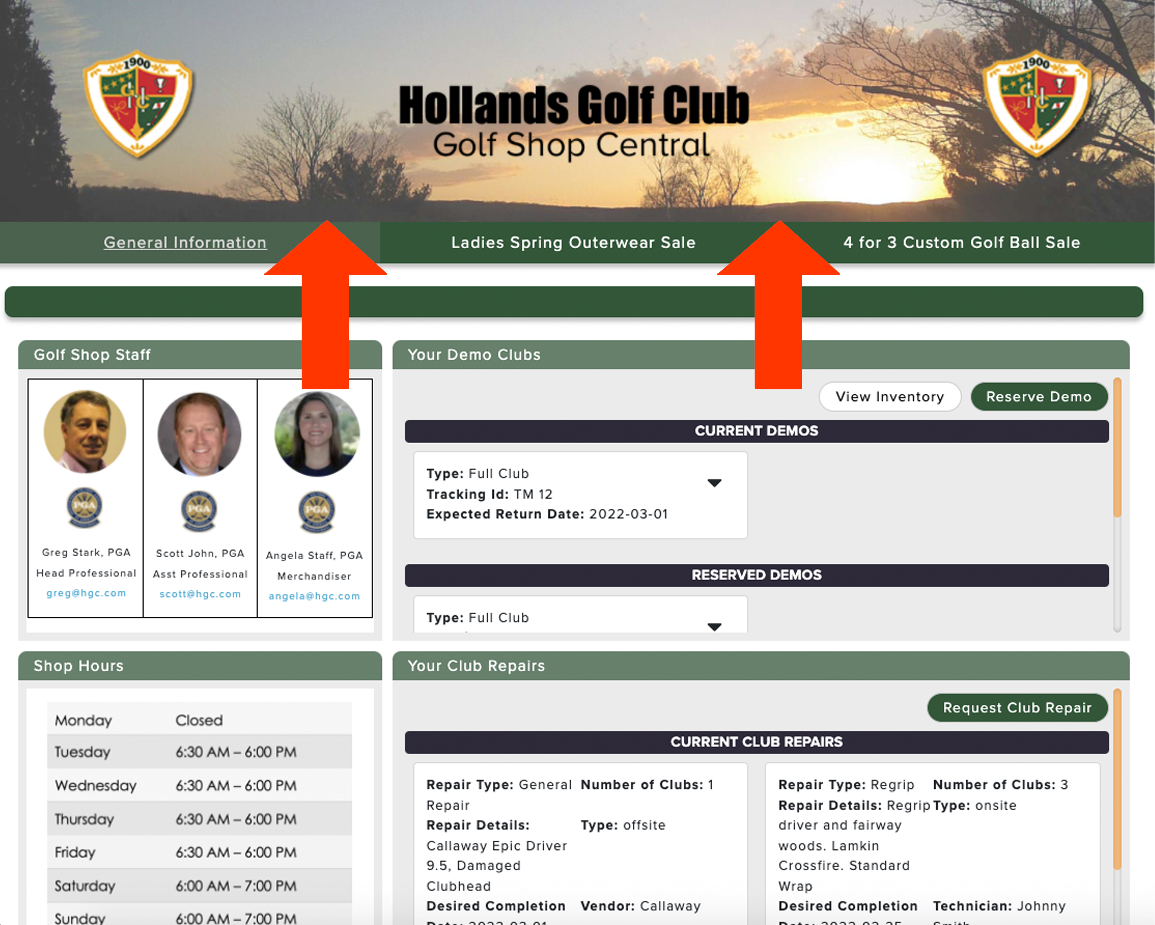
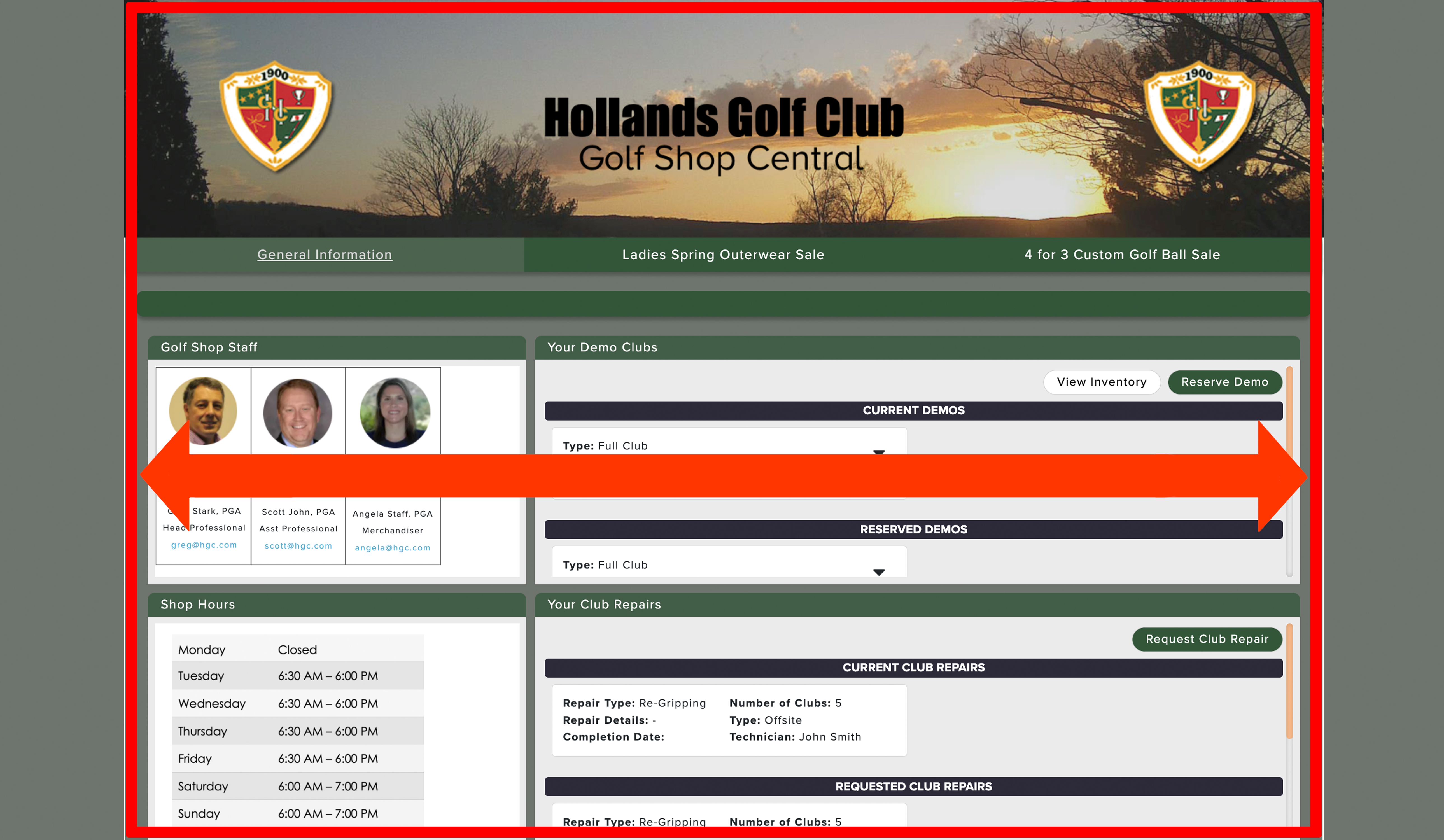
The banner is displayed at the top of the Member Portal (as shown below).
You can use many different photo editing programs to design and create your own banner. For the banner to be displayed perfectly aligned on the portal, the image width must be the same as the container width defined above. Banner heights typically range from 180 pixels to 250 pixels.
When selecting your banner, you will have two options:
Default Banner: If you have a default banner, it may already be displayed. You can change the default banner on the manager site by going to Settings > Logo(s) & Banner(s). For more details on managing your default banner, Click Here.
Custom Banner: If you want to use a banner different from your default one, you can use a custom banner selected from your computer. For more details on choosing a custom banner, continue reading this article.
Custom Banner:
If you would like to use a banner other than your default banner, follow these instructions:
Select "Custom Banner" (as shown below).

In the pop-up, navigate to the banner you wish to upload.
Click on the file and press "Open."
To complete the upload process, click "Save" in the lower right-hand corner.
Container Width:
The container width determines the size of the area containing the main Member Portal Content (e.g., banner, tabs, blocks, tiles, etc.) (as shown below). The area beyond the container and behind the container is the backsplash.
To set the container width, follow these instructions:
Select a container width (as shown below).

To complete the process, click "Save" in the lower right-hand corner.
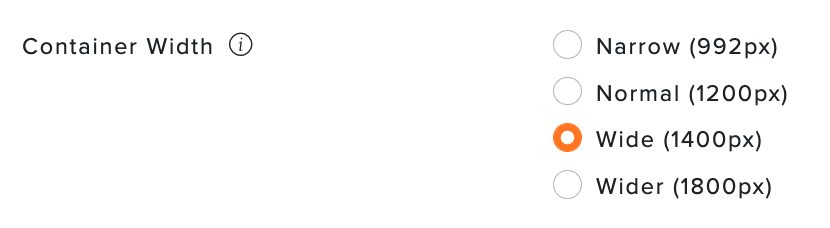
Note: Regardless of the container width selected, the page will be responsive to the member's browser and respond to changes in the width of a browser window by adjusting (if necessary) to best fit the available space.
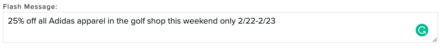
Add a Flash Message:
Flash messages are a great way to communicate important information to your members. It displays a short message in a "ticker tape" banner moving across the top of each page on the Member Portal (as shown below). Keeping the message short works best so they will see the pertinent information quickly
To set the flash message, follow these directions:
Enter the message in the text box below "Flash Message" (as shown below).

To complete the change, click "Save" in the lower right-hand corner.
Note: To remove a flash message, repeat these same steps, but instead of entering the message, delete the message from the text box.
Portal Layout:
Member Portals allow managers to create a single cohesive page with a flexible layout that can include multiple tabs, blocks, columns, and tiles, making it easy for your members to navigate and find the information they seek. The following links will guide you to the appropriate articles to assist with designing and customizing your Member Portal:
Portal Layout: With Member Portals, you can have a single tab or multiple tabs. Within each tab can be one or more blocks. Blocks can have a single column or two columns. Each column can contain one or more tiles (which hold the content). Below is an example that illustrates the structure:

Tile Options: Each tile includes content from one of the available tile options: